deanne3899's Kitchen
Newly Updated Kitchen!


Contact: deanne3899 (My Page)
Posted on Sun, Aug 20, 06
Link to kitchen photos: http://share.shutterfly.com/action/welcome?sid=8EatmLhyzbsMU
Details:
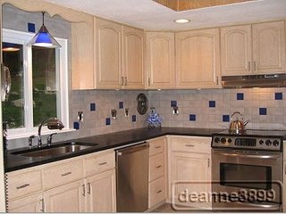
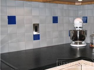
- Countertops: M. Teixeira Soapstone Counters: Belvedere (previously known as Cobra B) DH did it himself! What a HUGE job that was, but he’s so meticulous that I knew he’d be up to it. The cut-out for the undermount sink took the longest- 6+ hours. He also had to build up the cabinets a ¼ inch or so to meet the backsplash. Slabs: 84x26, 60x26, 60x26 & 36x26 Picture #9 has two seams in it, can you see them? The original counters were Formica in a speckled gray. They weren’t really that bad, but once I read about soapstone, I knew I wanted it!
- Backsplash: Striped the sealant off the grout, ordered light gray grout colorant from Aqua Mix & re-did the grout (it was the ugliest color). We replaced hideous decorative tiles with Ultra Glas Linen Tiles in Cobalt Blue. I think there may be too many decorative tiles, but we worked with what we had. We also changed the outlets to black & added new switch plates (stainless from HD). I added the most awesome Crosley brushed stainless telephone!
- Sink: We replaced the bisque Kohler cast iron sink with the under mount C-Tech Britannica. It is beyond gorgeous. We made a design decision to install the sink with the drain in the front because we liked it better that way. We reused the Delta chrome faucets we had as we liked the style. I had DH not install the soap dispenser so I would be locked into four holes forever, so we have the three now.
- Lighting: DH did the undercabinet lighting (Xenon) himself & we added a new pendant over the sink. We also replaced the canisters with ones with glass lenses to help keep the heat in. I adore the undercabinet lighting! What a huge difference.
- Appliances: Bosch DW & cabinet depth French Door Jenn Aire refrigerator. We were limited on fridge size with the cabinets already in place, but what a huge difference! The old fridge stuck out 5-6 inches & was bisque. Just by changing the fridge, it seemed we added a foot to the room.
The kitchen is a u-shaped lay-out- a pretty good one with tons of storage. It opens into the dining room which opens to the living room. Three years ago we put in new porcelain tiles in the kitchen and dining room (check out the lovely orangey-pink vinyl tiles it replaced!) and bought a new stainless Frigidaire Professional Series ceramic top stove to replace the rusty, ugly bisque one that we inherited. At that time I also changed the cabinet pulls to a stainless (brushed?) something or other. In the first three pictures you can see how the kitchen was when we moved in-the pink vinyl floor, the filth (DD's wrinkled nose), the cheap, fake brass pulls, the gray formica counters, the dirty grout backsplash & the rusted bisque appliances.


0 comments:
Post a Comment