
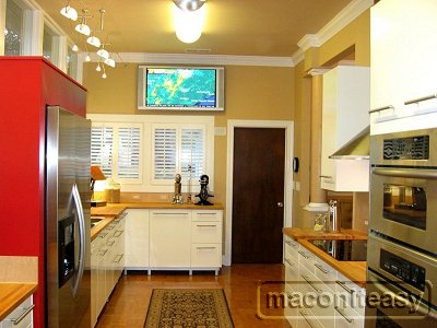
maconiteasy's Kitchen
Ikea Applad White - Before & After

Contact: maconiteasy (My Page)
Posted on Sun, Dec 10, 06
Link to kitchen photos: http://www.photobucket.com/albums/o220/maconiteasy/Kitchen%20Before%20and%20After/
Details:
- Cabinets: Ikea Applad White w/ Ikea Lansa handles
- Countertops: Ikea Beech butchblock
- Appliances: Kitchenaid Architect Series (Lowes)
- Exhaust Hood: Sirius (from the web)
- Main sink: Ikea two-bowl with drainboard and Blanco faucet (from the web)
- Coffee sink: Elkay with drainboard and Blanco faucet
- (both from the web)
- Cable Lighting: Ikea and Home Depot
- Ceiling Fluorescents: Lithonia (Home Depot)
- Undercabinet Lighting: Cyberlux LED Aeon ProHB
- Wall Paint: Sherwin Williams Bagel
- Ceiling Paint: Sherwin Williams Interactive Cream
- Refrigerator Enclosure Paint: Sherwin William Hearthrob
- Trim: Benjamin Moore White 314 01
- Flooring: Hevea Parquet (Lowes)
- Backsplashes: White Maple Veneer (local hardwood supplier)
- Outlet covers: White Maple (from the web)
- Column: White Maple Veneer (pine column and capitals from Lowes; veneer from local supplier)


5 comments:
What a fantastic kitchen!
Very tastefully done, congratulations. I like the bold use of color combined with traditional and cutting edge design elements. The cable lights are brilliant.
I love your kitchen! I am so glad ot see a flourescent that looks nice. I'll be searching for one soon. Also, I've been studying paint colors for my entire home. I've narrowed down the kitchen to Sherwin Williams Patience, Sw Interactive Cream or Biscuit, SW Divine White, or SW Moderate White. Anyhow, do you like your interactive cream?? I don't want a bright kitchen, but it's the color i'm trying to pull from my granite. Would you say that interactive cream is Bright or soothing?
thanks,
bridget
I have narrowed down my kitchen colors to interactive cream, biscuit, patience, divine white, and moderate white. I'm trying to pull the orangey pink color from my granite, but I don't want a bright kitchen. I'm going for soothing. Would you say that interactive cream is soothing or bright? it's the exact color in the granite, but I'm afraid it's bright. Not that anything is wrong with bright. It just won't flow with the rest of the home.
thanks
bridget
Beautiful kitchen!
Post a Comment