karenforroses' Kitchen
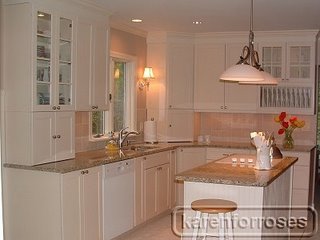
My kitchen's almost done!


Contact: karenforroses (My Page)
Posted on Fri, May 5, 06
Link to kitchen photos: http://s50.photobucket.com/albums/f341/Karen4Roses/New%20Kitchen/
Details:
- Cabinets: KraftMaid maple with bisque glaze
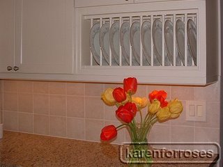
- Granite: New Venetian Gold
- Backsplash: ceramic tile - we special ordered through Lowes. It's called Ocean Pearl. We wanted something light and neutral that wouldn't "fight with the granite for attention".
- Double Ovens: Jenn Aire
- Cooktop & Refrigerator: Kenmore
- Dishwasher: Bosch
- Sconces: Restoration Hardware
- Double Pendant: Five Rivers
- Sink: a stainless steel Kohler undermount (K-3325-NA Undertone extra-large retangle undercounter - 23" x 17 l/2" x 9 l/2").
- Faucet: Price Pfister pullout faucet in brushed nickel.
- Paint: The paints are O'Leary Ceramic paint - the darker color is 'Khaki' -the lighter was custom blended - color matched to our KitchenMaid Bisque maple cabinets.
We used plug moldings - I like the way they're accessible but out of sight. We have a separate food pantry in the laundry room, which is just around the corner from the kitchen. I keep most of my non-perishables there (with a basket - when I'm making a recipe I use the basket to 'shop' for the ingredients that are in the pantry, so I just have to make one trip).
We spent a lot of time with masking tape figuring out a traffic pattern for the French doors, since a table and chairs will go by the bench seating. Because we had extended the island and south wall of cabinets, it did narrow the area to the door. Since we didn't need a large table and lots of chairs (the dining room is just off the kitchen when there's more than my husband and I and/or two granddaughters eating) we decided on a small table and two chairs (the bench seats two comfortably also). We wanated a simple shaker style table and shaker high back chairs, but realized that the optimal size for the table would be 30" wide x 48" long. We couldn't find anything that size that worked, so we special ordered it from Tom Seeley furniture along with the chairs. It should arrive in the next few weeks. I'll post pictures when they come. Anyway, the narrower table allows for an "aisle" around the table and out the French doors. We ordered the outswing doors in order to maintain that traffic pattern.


4 comments:
Karen,
Your kitchen is a study in beautiful simplicity! I love the clean, serene color scheme (didn't mean that to rhyme!) and the use of glass. Bravo!
Amy
Hello Karen; I stumbled across this blog while researching ideas for my own kitchen renovation. I very much love your cabinets and countertops. Can you tell me how you are liking the KraftMaid cabinets so far? I have heard a lot of conflicting reports on them so I would love to hear your opinion having lived with them for a while. Thanks so much! Your kitchen is beautiful!
Hi Karen, Your kitchen looks great. I am considering the same cabinets. How do you like them? Do the doors show a wood grain or do they look painted?
beautiful kitchen
Post a Comment